All Work
Food Brand Identity & Web
CRAVORA
A food brand mark built to work at any size, from icon to storefront.
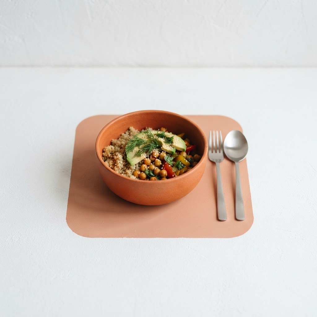
Overview
CRAVORA is a food brand that needed a mark and a minimal digital presence before launch. The identity had to communicate appetite instantly, in a single symbol, without relying on a long tagline.
Services
- Brand Identity
- Logo Design
- Web Design
- Brand Guidelines
The Challenge
Early-stage food brands often launch with a wordmark that collapses on a phone icon or a menu board. CRAVORA needed a flexible mark that reads clearly as food at 24 pixels and still holds up at scale.
The Solution
We designed a rounded-square mark combining cutlery with a circular flow, set in a burnt orange that reads warm rather than generic. The site keeps that mark as the only focal point — white space, one color, no competing copy — so the brand is unmistakable from the first second.
Results
01
A single mark that reads as food at any size
02
One-color system that scales across print and screen
03
A launch-ready identity with room to grow
Next project
Directional Plus LLC